Wednesday, 22 May 2013
Exam Final Piece
These are my three final pieces for the exam topic. I decided to paint each one in a slightly different way, illustrating the main focus points of the theme. The first shows the outside decay from nature on the building, the second shows the clean lines running throughout the inside and the third shows the glass in between, distorting the view from outside to inside.
Rust Sculpture
I rusted steel rods to show the effects of natural erosion on this man made object. I then put them together in this sculpture, demonstrating the straight lines which link to the perfect parallel lines of the building images.
Exam Prep Sheets
I have used a variety of medias for my exam topic to develop from my original photos following the theme of inside, outside, in between.
First I used oil paint to present the images in my painting style. I then printed an etching several times concentrating on highlighting different aspects of the etching each time. Also I edited some of my original images to exaggerate both colour and structure.
I used a palette knife for these three paintings. It creates further texture and depth to the paintings while still retaining structure through the lines of the palette knife.
I drew one of the photos as a biro drawing to illustrate the detailed structure within the building.
Exam topic photos
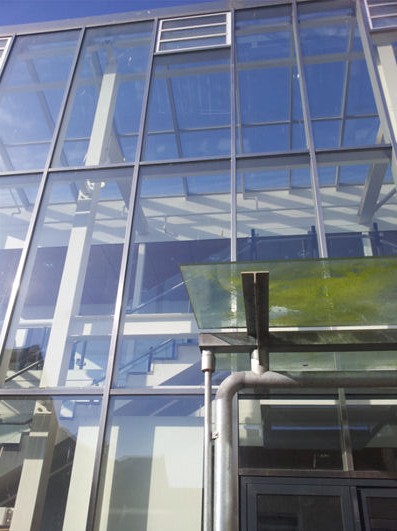
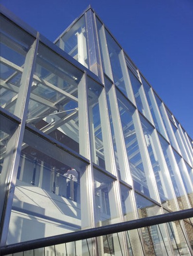
I took these photos for my exam topic of "inside, outside, in between."
These building images show the decay of the outside of the man made structure while the glass in between protects the inside from the same erosion.
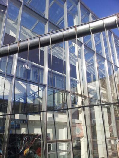
The rich blue and green colours here contrast well with the harsh metal lines of the buildings, while the glass throughout connects the two in the photos.
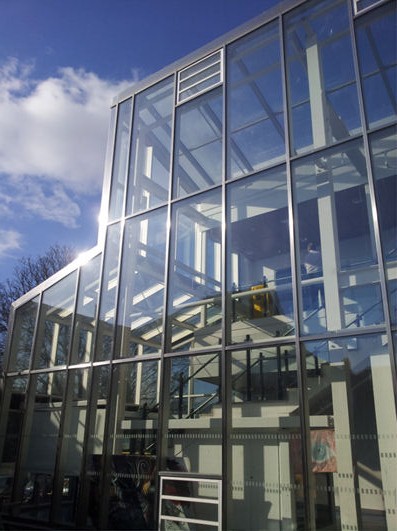
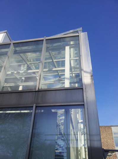
Tuesday, 21 May 2013
Personal Study
Through my AS work, I used a range of different themes as
inspiration. I chose subject matters such as time and Darwinism, the body and
seascapes. The variety of themes pursued has allowed me to use a great variety
of mediums to express my ideas. For the project of time I used a mixed media
piece with a working clock and Darwin’s ‘ape to man’ to show the insignificance
of this particular evolution in contrast to the extent of time given by
intertwining cogs. I looked at Dali’s ‘Persistence of Time’ and ‘Soft Watch at the Moment
of First Explosion’ to see how others had depicted time in art. I took a
very different path when I looked at the body. Instead of looking at structural
aspects, I instead chose to add cloth to the body and paint in smooth lines,
giving an alternative outcome to my previous work. I attended many life drawing
sessions to improve my drawing and observation skills then developed what I had
done by producing oil paintings of the body and fabric. I concentrated on the
soft lines of both the flesh and the material that I had spent time observing
in life drawing to create Pre-Raphaelite inspired images. I transferred the
skills I have acquired in life drawing to new subject matter. For example, these
skills have allowed me to achieve detailed Biro drawings and etchings of nets
and ropes found in a harbour as part of my seascape work. I looked to the
minute details of the harbour, as well as the larger picture to achieve
seascapes, showing the
contrast between the smooth lines of the ropes, the
geometrical shapes on the masts of the boats and the gentle movement of
the sea. As I have looked at a balanced range of natural subjects and mechanical/structural subjects, through my personal study, I would like to look at the relationship between the two in art history.
Louis Comfort Tiffany
Tiffany is best known for his work in stained glass, particularly
with the Tiffany Lamps and worked in glass making and designing mostly in the
late 1800s. He pursued a very different outlook to glass work than many of the
other glass makers of the time, leaving mineral impurities in the glass. Using
opalescent glass in a variety of colours, created a new and unique style of
stained glass that changed the way many saw this art form. Tiffany was
influenced by his father’s jewellery business and medieval glass works and
combined these two inspirations into his own glass works. It is immediately apparent
why Tiffany Lamps became so popular, showcasing technically good glass work in
very different style than traditional, medieval stained glass. The Tiffany
Lamps link to my work as through my personal study I have looked at the overlap
of natural and man made and Tiffany illustrates this by using such a man made of
the lamps to present a delicately detailed depiction of nature in stained
glass.
Piet Mondrian
Throughout Mondrian’s career, he had many influences, the
first being spirituality. He aimed to distil the real world to its pure
essence, to represent the contrasts of the universe in eternal tension. He was
also heavily influenced by cubism in his early work, but moved beyond the
Cubists’ degree of abstraction. His studies of trees moved more towards abstraction
with geometric shapes and interlocking planes. Finally, he moved towards the De
Stijl movement, founding De Stijl, a journal of the De Stijl group with Van
Doesburg and following the use of Primary colours of Van der Leck.
His De Stijl artwork originated from looking at nature and
this has inspired my work on both taking nature to its first principles and by
making natural creations mechanical. By ignoring the detail and concentrating
on the mood something portrays, Mondrian has allowed such organic things to be
so regimented, yet it does not feel artificial. This has influenced me to look
beyond an image or a scene and, at first, just focus on the basic outline.
Mark Tobey
Tobey was most influenced by his travels. For most of his
life he moved from city to city seeing different styles of art around the
world. He took a particular interest in Eastern art and calligraphy which
greatly influenced, in particular, his ‘white writing’ pieces, but also his
whole abstract expressionism period, placing detailed patterns similar to
calligraphy over his abstract expressionist paintings.
You can see from his paintings that there is a similar style
to the other abstract expressionists as they all influenced each other through
this movement, creating art in the same style, yet portraying different
messages through individual work. The key aspect of abstract expressionism, and
in particular in Tobey’s work, is colour. There is no need for detailed
outlines as the colour and shape use gives the viewer enough of the picture for
the pieces to be abstract yet understood at the same time.
This has influenced me by seeing the emotion in a subject
and using this emotional response to draw out the importance of the scene such
as colours and patterns to create something that is not realistic, but an
exaggerated view.
Lyonel Feininger
Painting was “a path to the
intangibility of the divine.” -Feininger
Feininger’s work shows both the structure of cubism, and the
freedom of expressionism. The Cubist influence is obvious with dramatic and
harsh lines cutting through the paintings, but then through his expressionism
influences, he softens and distorts the images to create something unlike
either of these movements. This individuality came from his surroundings of
Berlin, his photography and his wood carvings. He painted the Berlin
skyscrapers in such a way to show their somehow portentous stance, yet see
their beauty with light illuminating them and took this same approach with his
seascapes. His photography also aided this, allowing him to see his
surroundings in a different manner to how a painter would view them, giving him
an in depth vision which he could then remove aspects of detail from. Finally,
his wood carvings helped with his cubist influence, with sharp lines against
the soft and natural wood, a contrast that can also be seen in his paintings.
Feininger’s work has influenced me with the colour use.
Within the sections of his work, there are very subtle colour changes, but when
the section changes, the colours dramatically change too, whilst still
complementing each other. With a palate knife, I am attempting to create this
contrast of subtle changes with dramatic changes incorporated too.
Giacomo Balla
Balla underwent a dramatic change in his painting style when
he began to look at light, movement and speed. He watched scenes such as a bike
being ridden, then illustrated these to highlight these key features. The
object is not seen in his work, as it is shown almost like a vapour trail of
the movement, continuing across the page. He used layers to create this effect
so that each small motion could be drawn in a fluid way, one after the other
overlapping so you can visualise the movement even without the initial object
there. He uses many thin lines and contrasting colours which aid the sense of
speed whilst showing the effect of light on the objects.
I have incorporated this mechanical interpretation of
movement into my own work, but I have used it within more natural surroundings.
I have used it to show the speed and action of a dragonfly’s wings and Balla’s
detailed pieces have helped me to apply movement onto a still painting.
Roy Lichtenstein
Lichtenstein was a Pop Art painter who used a comic strip
style to parody American culture. His iconic paintings are so recognisable and
still used in popular culture today. They are perhaps so striking because of
the use of the primary colours with heavy black outlines. He began by using
techniques of abstract impressionism in the 1950s but added pop culture themes
such as paper money to his work. This developed further into the Pop Art style
in the 1960s by using comic strips, cartoons and advertising as inspiration,
often taking, for example, a comic strip and recomposing it the Pop Art style
with the primary colours. Even though he had a very distinctive style developed,
he still took influence from the works of artists such as Picasso, Mondrian and
even Monet. At the time, many critics questioned Lichtenstein’s artistic
ability with Life magazine asking, “Is he the worst artist in America?” This
has since been proven wrong by looking at the longevity of his work and its
great influence on popular culture. Even with some criticism at the time,
Lichtenstein was never fazed by opinions of his work, saying; “I don’t have big
anxieties. I wish I did. I’d be much more interesting”. I think that Lichtenstein’s
work was very effective in questioning the American culture at the time and his
ironic use of cartoons etc has had a timeless effect for Pop Art. Lichtenstein’s
paintings and prints link to my work because they explore human impact on
culture and surroundings and though there is not a theme of nature evident, his
development and influence on later art and culture is very influential to look
at and expand my view from.
Franz Marc
The focus of Franz Marc’s work was of animal subjects and
the idealised spirituality of them. The most striking aspect of Franz Marc’s
paintings is the use of bold, contrasting primary colours. While looking at
animals in a spiritual way, he developed this use of colour to represent
masculinity with blue, femininity and sensuality with yellow, and red with the
material world he was trying to get away from. Along with Kandinsky, he founded
Der Blaue Reiter group in the hope of introducing spiritualism to art. Although
the group had a common sense of spirituality, each individual’s style of art
was very different. This influenced Franz Marc and his group to intensify the
emotions in their pieces which led them to the high point of German
expressionism.
The use of strong colours to convey messages and emotions is
what intrigues me the most about Franz Marc’s work. I am learning to pick out
important aspects of my work and intensify them to convey a message in the
piece. His work has shown me to look deeper than just painting a ‘pretty
picture’ and convey what I really feel about the subject.
Wyndham Lewis
Wyndham Lewis was a founder of the Vorticist art movement
and an editor for the Vorticist’s literary magazine, BLAST. Vorticism came from
a mixture of Cubism and Futurism, neither of which suited Lewis entirely. He
thought that Cubism was not ‘alive’ unlike Futurism, but Futurism lacked the
structure that Cubism brought, therefore Vorticism was born to incorporate
these two factors. Lewis used the industrialisation of Britain as their
subject, using large amounts of black contrasting with sepia tones and straight
lines to create the feel of industrial power. The subject matter he uses though is not
necessarily industrial though, as he even used figures as the base of some of
his creations.
“If the world would only build temples to Machinery in the
abstract then everything would be perfect. The painter and sculptor would have
plenty to do, and could, in complete peace and suitably honoured, pursue their
trade without further trouble.” –Wyndham Lewis
Giacomo Balla
Balla greatly influenced my main painting from my personal
study. I had photographed a dragonfly after a chance sighting, capturing the
dragonfly at exactly the right angle with just enough contrast and focus and
used this image in conjunction with a Balla image to create the effect of
movement of the dragonfly. Although Balla used machinery as his influence, I
decided to use the delicate dragonfly to show contrast and further illustrate
my theme of an influence of nature combined with industrial structure in art.
Personal Study Conclusion
When I had a chance sighting of a forming dragonfly, I used
photography as the first of many mediums from this subject, capturing the
dragonfly at exactly the right angle with just enough contrast and focus. Carefully
taking these photographs allowed me to expand into computer editing my images
then expanding these ideas further into various mediums such as acrylic and Biro.
These particular images lead me to research into how nature
influenced some of the most structural artists of the 20th century.
Furthermore allowing me to see the construction behind something so delicate,
looking at the path of Mondrian from sketches of trees to his later geometrical
De Stijl works, to emphasise the structural aspects of my work. I have also
looked at the Futurist artist Balla as he showed the movement of mechanical
objects through his paintings. Blurring the lines between natural and
mechanical, I subsequently used the Futurist technique of capturing movement to
show the delicate movement of a dragonfly’s wings in this structural way.
I continued to explore this concept of natural and
mechanical through the rest of my personal study. Many of the structural
artists of the 20th Century had very geometric and bold outcomes of
their work. However, it is where these works originated from that intrigued me,
as many looked to such forms of nature as trees and plant life instead of more
structural influences. I have explored this connection through my work, looking
at how these artists progressed and where all of their influences finally led
them. I have also pushed the mix of nature and structure further, taking the
work of structural artists and enhancing both the natural and structural
aspects within to create my own work in an influenced style. This helped show
the thought patterns behind the pieces as well as the polished lines of the end
result. I also developed my view of artists using nature as their subjects
directly such as Tobey and the abstract expressionists, and Franz Mark with
animals, to see how they abstracted their work to only give an impression of
nature. Through my personal study, I have successfully improved my
understanding of the development every artist has to go through to achieve a
unique style and a timeless piece of art.
Monday, 20 May 2013
Palette Knife Painting on Wooden Planks
I further developed my palette knife painting with these paintings on wooden planks. They are more abstract so I concentrated on the colours, picking out areas of stronger colour and tying in the five paintings with a similar colour palette.
Palette Knife on Board Chamonix Scene
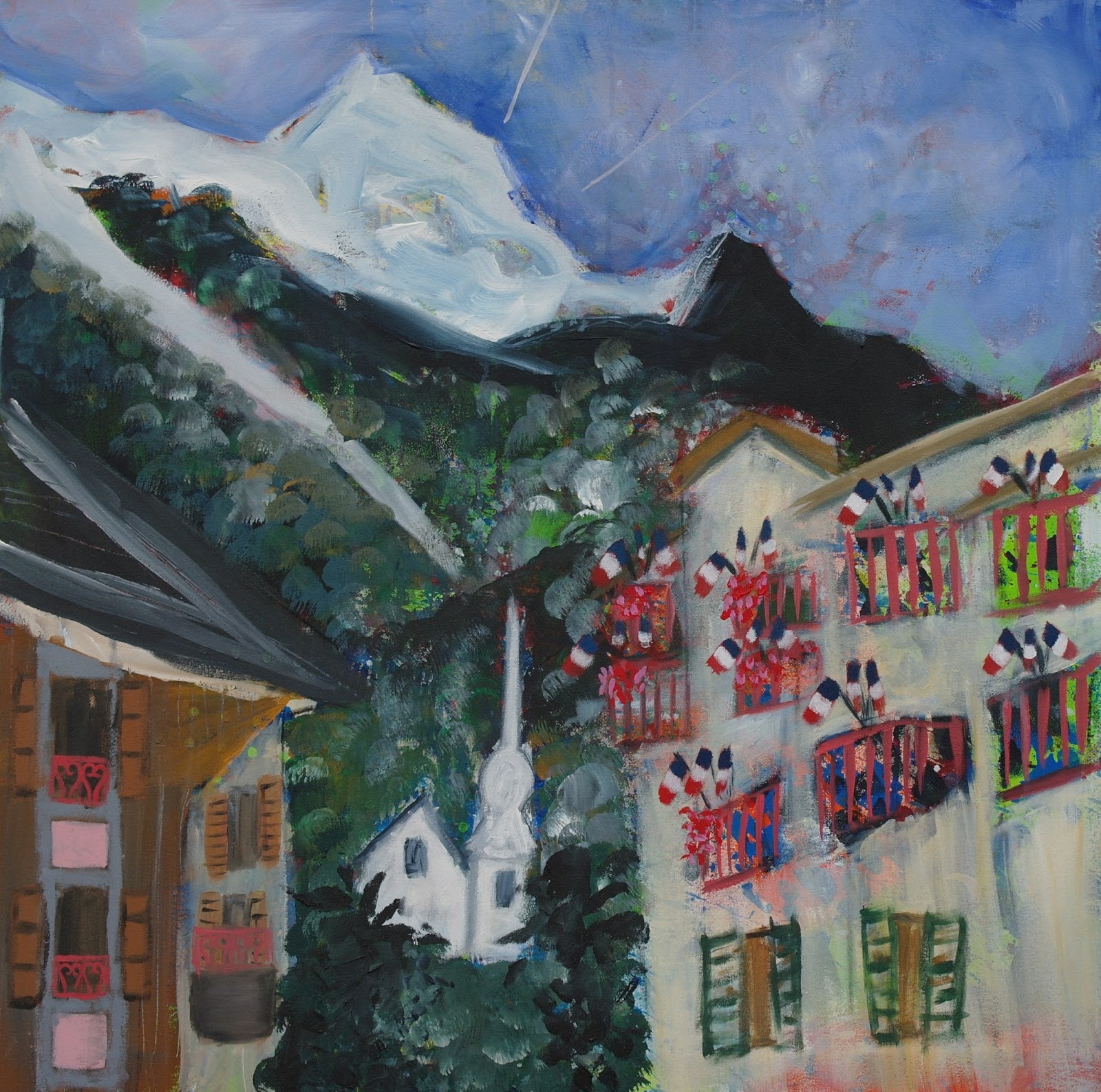
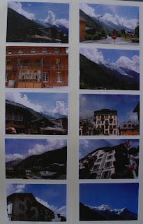
I used a palette knife for this painting. It shows progression of my work, as I experimented with different styles of painting. I chose to do this composition of buildings and mountains as it highlights the hight of the buildings in Chamonix and draws the eyes upwards, just as they did in the town.
Acrylic on Canvas Chamonix Scene
I used acrylic paint and a range of paintbrushes for different effects within this painting. I also under painted it for depth and this is most evident in the sky.
Etchings of Utrillo Street Scene
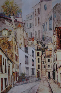
I did an etching of a Utrillo street scene in my own style. I used string and a mix of colours to create different effects in each one.
Subscribe to:
Comments (Atom)


